Navigating New York City can be an overwhelming experience, particularly for individuals with disabilities. Recognizing this challenge, our team embarked on a mission to make NYC more accessible, leading to the creation of AccessibleNYC. This innovative project has been honored with numerous prestigious awards, including the ADC Award from The One Club for Creativity, Muse, Indigo Awards, Graphis Awards, Creative Conscience, and DNA Paris Awards. Here, we share the process, ideation, and invaluable learnings that defined this award-winning initiative.
Identifying the Challenge
The core challenge was clear: navigating around NYC is confusing and frustrating, especially for those with disabilities. Our goal was to create a solution that would make the city more accessible for everyone. We began by conducting a thorough competitor analysis, examining existing solutions like Yelp, iAccess Life, and Wheelguide. This analysis helped us understand the market landscape and identify gaps that our project could fill.
Empathy Interviews: Understanding Real Needs
To gain a deeper understanding of the challenges faced by individuals with disabilities, we conducted empathy interviews with Estela, who has a mobility impairment, and Dona, who has a hearing impairment. These interviews provided vivid insights into their daily experiences, challenges, beliefs, and needs. Some key findings included:
- “I often can’t see the announcements on screen because I’m short and someone is blocking my view.”
- “It’s hard for us to even get to a kiosk.”
- “We are always tired because things are much more time-consuming for us.”
- “Growing up, I had no one to share my hardships.”
Pivoting the Solution: From Insights to Impact

Initially, we considered designing an information kiosk to help users navigate the city. However, as our interviews progressed, we discovered that street kiosks were not very accessible for our target users. Instead, we learned that wearable devices held significant potential in enhancing accessibility. Additionally, we realized that user-generated content could be burdensome for our users, leading us to pivot our solution towards a more streamlined approach.
Research and Insights: Defining the Problem
Our research revealed that most of NYC’s public transit system is not disability-friendly, with only about a quarter of subway and train stations being fully accessible. Key issues included:
- Anxiety due to crowded public transportation.
- Safety concerns.
- Poor communication regarding unexpected service changes.
Based on these insights, we decided to design a mobile and smartwatch app that would assist people with disabilities in exploring and enjoying NYC. Our goal was to increase mobility, comfort, and community engagement.

Introducing AccessibleNYC
AccessibleNYC is an interactive app designed to enable stress-free travel in NYC, tailored to various accessibility needs.
The first main feature, Plan Ahead, allows users to find detailed information about venues, including wheelchair accessibility, noise levels, lighting, and more. Users can check specific details such as the acoustics of a restaurant or the venue admission policy for caregivers, and even save their favorite places and routes for later use.
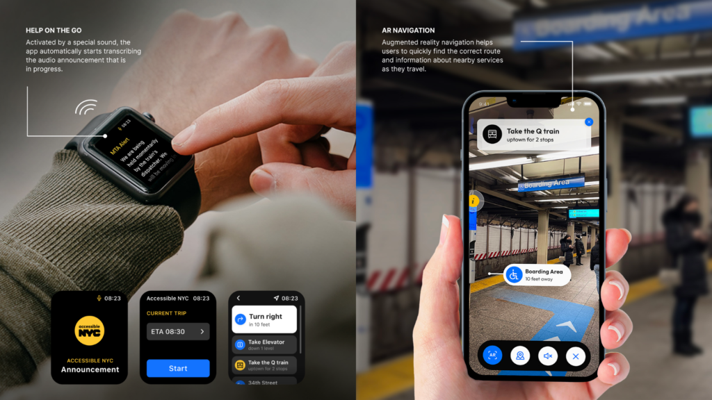
The Travel with Ease feature utilizes an AR-integrated map to provide the most accessible routes across the city. This feature also includes an audio guide that can be enabled for a hands-free experience, along with real-time notifications for unexpected route changes or emergency announcements.
Finally, the Find Community feature encourages users to engage with local activities, events, and resources, helping to build a stronger community. Users can stay connected with like-minded friends and find support and camaraderie within the community. These features collectively ensure that AccessibleNYC empowers its users to navigate the city confidently and inclusively.
Design Direction: Simplicity and Perceivability
Our design goal was to create a clean, friendly, and inspirational interface. Key principles included:
- Simplicity: Ensuring familiar, consistent interactions for easy navigation.
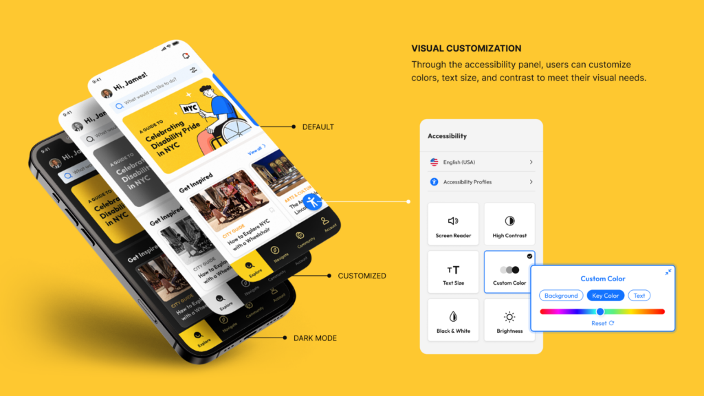
- Perceivability: Making all content accessible, whether through sight, hearing, or touch.
- Iconography: Using simple, recognizable icons with consistent size, detail, and stroke thickness.
- Illustrations: Friendly and welcoming, with high visibility for vision-impaired users through limited colors and thick black outlines.
Key Learnings
The importance of empathy interviews cannot be overstated. They were crucial in helping us understand the real-world challenges faced by individuals with disabilities. We learned that disability is not just a health challenge but also a mismatched interaction between a person and their environment.
AccessibleNYC aims to bridge this gap, allowing users to create personalized experiences based on their accessibility type, interests, and location. By addressing exclusion and designing for diversity, we strive to enable everyone to participate in society with a sense of belonging.
Future Directions
In the second phase of AccessibleNYC, we plan to expand our features to include support for users with cognitive and speech impairments. Our goal remains the same: to enable everyone to plan ahead, travel with ease, and connect with their community.
With AccessibleNYC, you can go further and do more. Together, we can make NYC a truly accessible city for all.
Case Study Video:


